TECHNICAL SEO // MOBILE UX
Mobile-First Indexing
Why Mobile Performance Matters More Than Ever and How to Optimize Your Site Accordingly
In today's digital landscape, where smartphones are practically extensions of our hands, Google's mobile-first indexing isn't just a technical detail—it's a game-changer for anyone serious about SEO. If your website doesn't perform flawlessly on mobile devices, you could be missing out on visibility, traffic, and conversions. As we step into 2026, with over 75% of web traffic coming from mobile users, optimizing for mobile isn't optional; it's essential. Google's algorithms have long prioritized the mobile experience, but recent updates, including tighter integration with AI-driven search and stricter spam policies, have amplified its importance.
This article dives into what mobile-first indexing really means, traces its evolution, and explains why mobile performance is critical right now. We'll also share actionable strategies to optimize your site, ensuring it ranks well while delivering a seamless user experience. Whether you're running an e-commerce store, a blog, or a corporate site, these insights will help you stay ahead in a mobile-dominated world. Let's get your site mobile-ready and future-proofed.
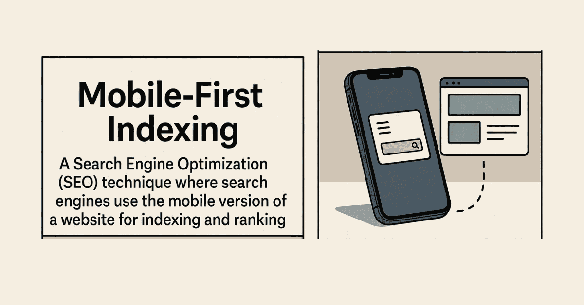
What Is Mobile-First Indexing?
At its simplest, mobile-first indexing is Google's approach to crawling, indexing, and ranking websites based primarily on their mobile versions rather than desktop ones. Introduced to reflect the shift in user behavior—where most searches now happen on phones and tablets—this means Googlebot, the search engine's crawler, defaults to the mobile rendition of your site when deciding its relevance and quality.
Unlike the old days when desktop was king, if your mobile site lacks content, has broken features, or loads slowly, it directly impacts your rankings across all devices. Even if your desktop version is polished, discrepancies can lead to penalties or lower visibility. Key to this is ensuring "content parity"—the mobile and desktop sites should offer the same valuable information, just adapted for smaller screens.
This isn't about making your site "mobile-friendly" in name only; it's about prioritizing mobile in design, speed, and functionality to align with how users actually interact with the web.
The Evolution of Mobile-First Indexing
Google's journey toward mobile-first began in 2015 with "Mobilegeddon," an update that boosted mobile-friendly sites in search results. But the real pivot came in November 2016 when mobile-first indexing was announced, acknowledging that mobile searches had overtaken desktop.
By 2018, it started rolling out selectively, and in March 2021, it became the default for all new sites. The full transition wrapped up around October 2023, with Google ceasing to index non-mobile-compatible sites by mid-2024. In 2026, it's not just standard—it's intertwined with broader SEO priorities like Core Web Vitals, E-E-A-T, and AI search experiences, where mobile performance signals trust and helpfulness.
Recent tweaks emphasize that even desktop-only sites can rank if they're accessible, but they're at a disadvantage. With AI tools like Google's Search Generative Experience pulling snippets from mobile-optimized content, the evolution underscores a "mobile-only" mindset for top rankings.
Why Mobile Performance Matters More Than Ever in 2026
The stats speak for themselves: Mobile devices account for the majority of global internet traffic, and users expect instant, frictionless experiences. Slow-loading pages or clunky navigation lead to high bounce rates—Google reports that a one-second delay can reduce conversions by 20%. In 2026, with AI reshaping search (think zero-click answers and voice queries), sites that excel on mobile get featured more prominently.
Mobile performance ties directly into Google's core ranking systems. Core Web Vitals—metrics like Largest Contentful Paint (LCP), First Input Delay (FID), and Cumulative Layout Shift (CLS)—are evaluated on mobile, influencing rankings. Poor mobile UX signals low-quality content, clashing with E-E-A-T standards and the Helpful Content Update.
Moreover, local and voice searches, which are predominantly mobile, favor optimized sites. For businesses, this means better visibility in "near me" results and higher engagement. In an era of AI spam detection and user-centric algorithms, ignoring mobile is like shooting your SEO in the foot—it's why performance matters more now than ever.
How to Optimize Your Site for Mobile-First Indexing
Optimizing isn't rocket science, but it requires a holistic approach. Here's a step-by-step guide to get your site up to speed.
1. Adopt Responsive Design
Start with a responsive layout that adapts to any screen size using flexible grids and media queries. This ensures content parity without maintaining separate mobile sites. Tools like Google's Mobile-Friendly Test can verify your setup.
2. Boost Mobile Speed
Speed is king—aim for under three seconds load time. Compress images with formats like WebP, minify CSS/JS, and leverage browser caching. Use a Content Delivery Network (CDN) for global users and prioritize above-the-fold content. Test with PageSpeed Insights to address Core Web Vitals issues.
3. Ensure Content and Metadata Parity
Make sure mobile users see the same high-quality content, structured data, and meta tags as desktop visitors. Update robots.txt to allow Googlebot access to all resources, and avoid hiding elements on mobile that could affect indexing.
4. Enhance User Experience
Design for touch: Use large, tappable buttons (at least 48x48 pixels) and ample spacing to prevent misclicks. Simplify navigation with hamburger menus and avoid intrusive pop-ups. Incorporate voice search-friendly long-tail keywords and optimize for local SEO with accurate NAP (Name, Address, Phone) details.
5. Implement Advanced Technical Fixes
Use HTTPS for security, add AMP for ultra-fast pages (if relevant), and ensure JavaScript renders properly on mobile. Monitor crawl errors in Google Search Console and fix any mobile usability issues flagged there.
6. Test and Iterate
Regularly audit with tools like Lighthouse or SEMrush's Site Audit. Gather user feedback through analytics to refine—track metrics like mobile bounce rate and session duration to measure success.
By focusing on these areas, you'll not only comply with mobile-first indexing but also delight users, leading to better engagement and rankings.
Conclusion: Embrace Mobile-First for Long-Term SEO Success
Mobile-first indexing has transformed SEO, making mobile performance a non-negotiable for visibility in 2026. With users demanding speed and simplicity, and Google rewarding sites that deliver, optimizing your site isn't just about rankings—it's about building trust and driving real results.
Start with a mobile audit today, implement responsive design and speed tweaks, and keep monitoring as algorithms evolve. In a world where AI and mobile converge, a stellar mobile experience sets you apart. Your audience is on the go; make sure your site keeps up.